Adventures with Customizing Scrollbars
During the process of developing my website at https://omduggineni.com, I wished to combine two elements generally not combined in a website: the scrollbar and the menu. This project taught me about UI design concepts and gave me the opportunity to apply them in a way that looked unique while both being usable and computationally efficient to implement. I also learned to look at challenges from the standpoint of a UI designer as well as a web developer. This section explains how I planned and executed the development of this functionality.
Motivation
Why do this? The reason for combining these two otherwise disparate aspects of a webpage is that they serve similar functions - a scrollbar tells the user about their physical position in a page, while a navigation bar tells the user about where they can navigate to. By combining these features, we can make an intuitive UI element that lists the sections of a page, shows which section the user is currently on, and allows the user to move between sections.
Inspiration
Similar existing navigation features: While combining aspects of a page as disparate as a scrollbar and a navigation bar may sound strange, other apps in the past have attempted to combine the idea of a scrollbar and a navigation menu before. Here are a few previous approaches I was inspired by when creating my design:
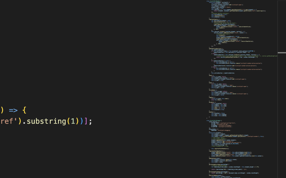
- "Scroll bar map mode" in code editors such as VS Code - this feature, present in the code editor I used to create my website, Visual Studio Code, gives a bird's eye view of the structure of code present in the current file, allowing the user to find a particular file or method more easily by showing them the overall "shape" of the code. This shows the user what is on the page and allows to user to easily skip to any particular section.
- Google Docs outline (on mobile): On mobile devices, Google Docs shows an outline of the parts of a document while you scroll. This allows for easy navigation between parts of a page.
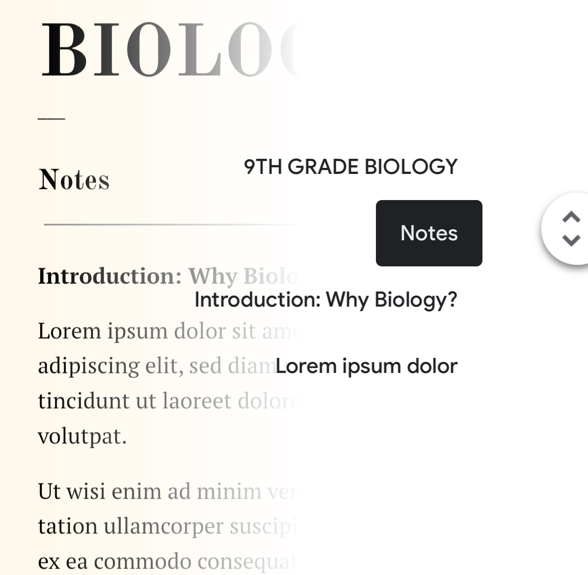
The goal of my project was to combine the major features of UI designs that show what kinds of content are on a page with the scrollbar, which shows where the user is on a page, allows them to navigate upward and downward, and gives them an idea of a page's length.
Design
The first thing I did in order to design this project was create a list of all of the different requirements I wanted it to meet. These were the most important ideas that surfaced:
- Mapping: actions the user takes should map cleanly to the user's existing idea of a scrollbar - the new design should not feel excessively foreign to someone who has only used scrollbars before. For example, the scrollbar should scroll vertically, and not horizontally like other progress indicators, because users normally scroll through a page vertically and inverting the axis in this manner would be confusing to the user.
- Discoverability: users of the website should be able to easily identify the major features of this scrollbar by trying them - feedback that the scrollbar provides should hint at its features without any explicit tutorial.
- Aesthetics: the scrollbar should be aesthetically pleasing and blend in with the rest of the website.
Initial Scrollbar/Website Designs
The below mockups were made in Figma.
When scrollbar is at top of page:

When scrollbar is at middle of page:
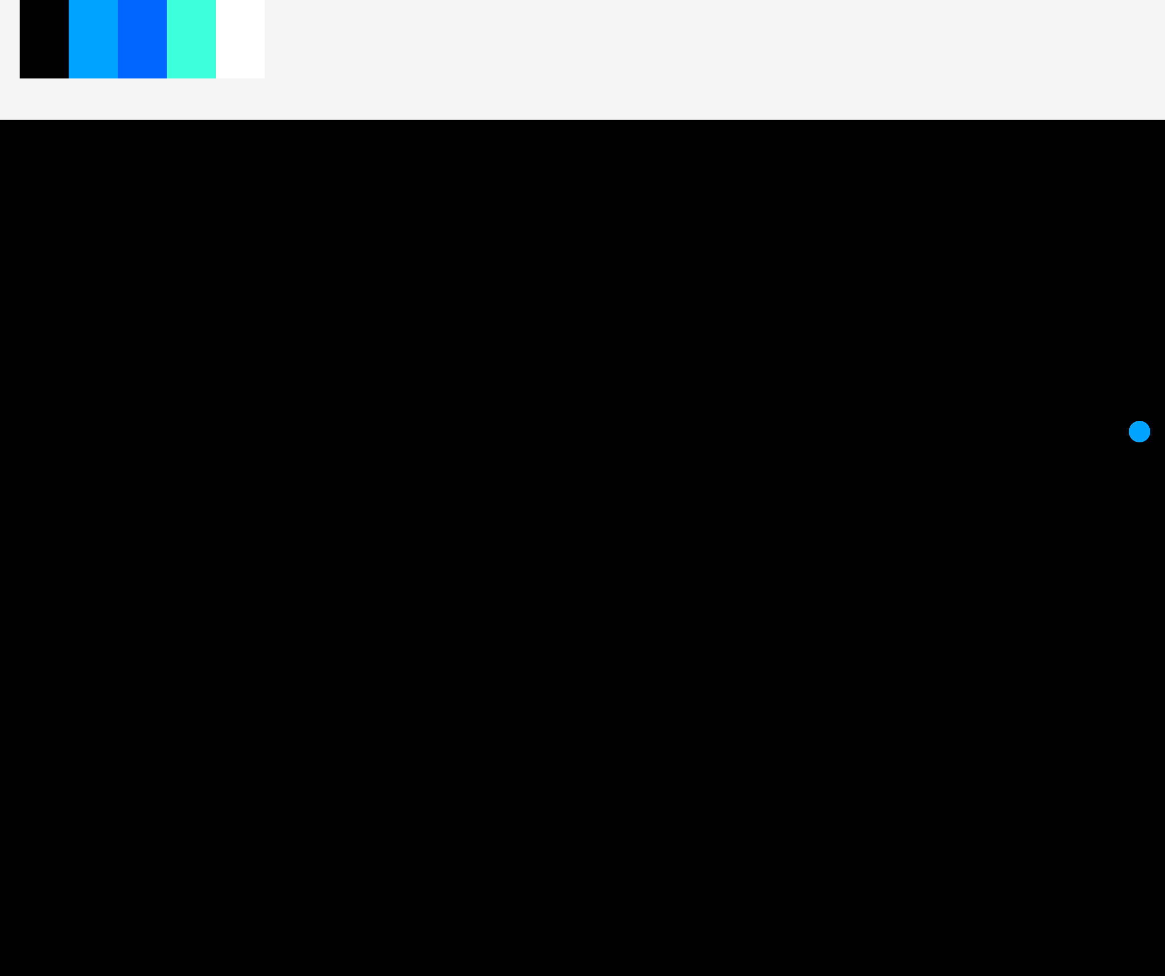
When scrollbar is hovered while in the middle of the page:
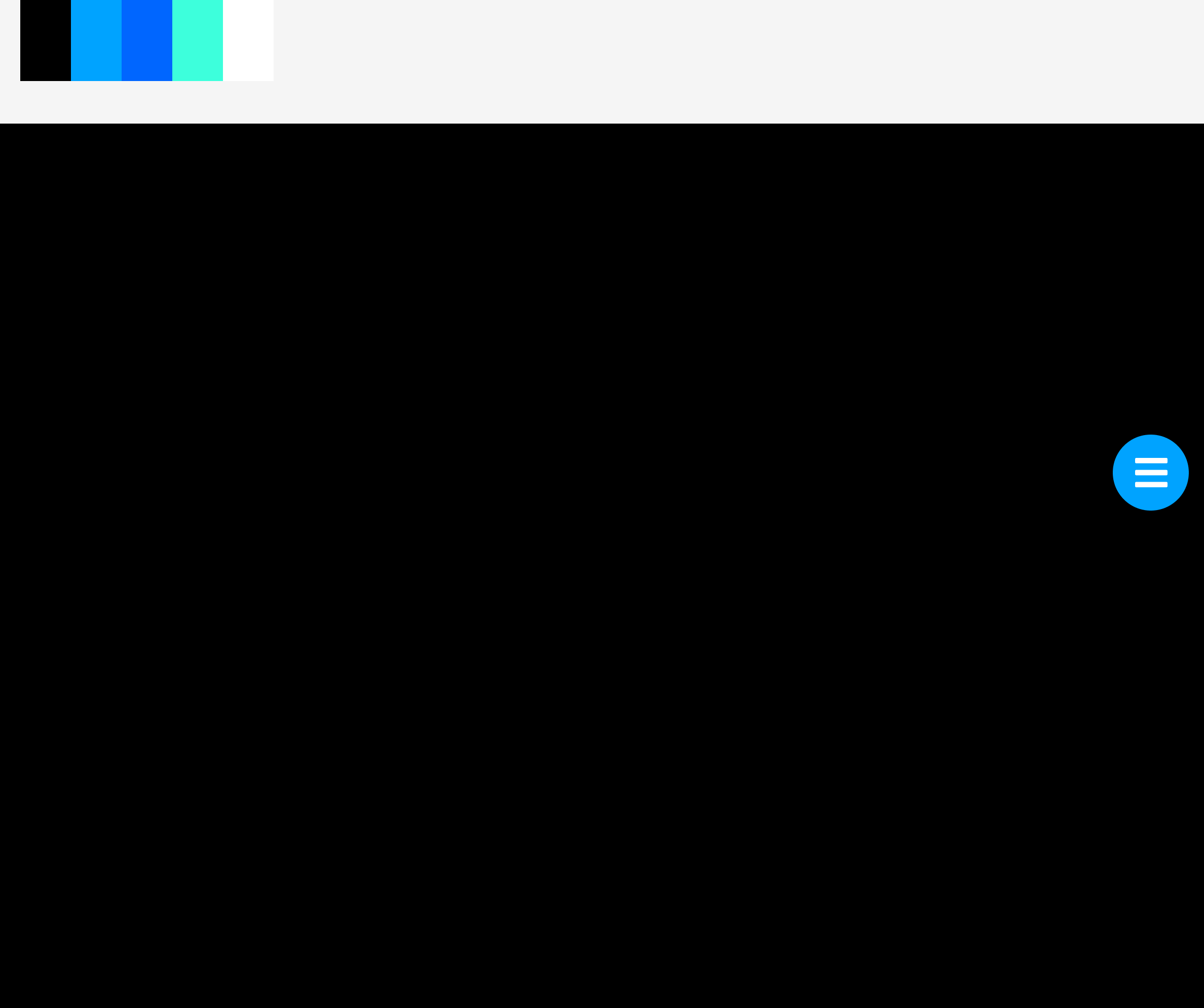
When scrollbar is open in middle of page:
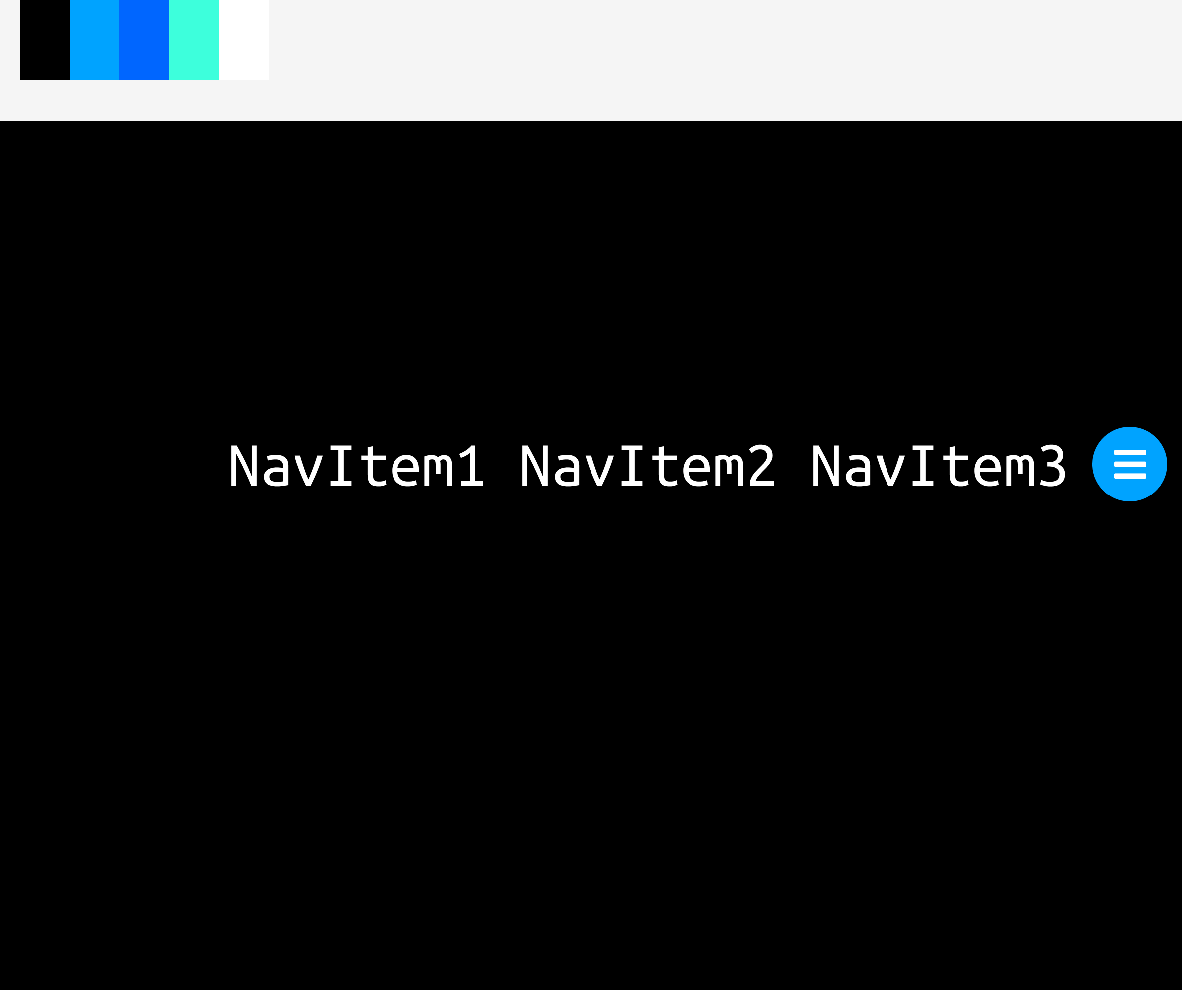
When scrollbar is at bottom of page:

Implementation
When implementing this feature, I ended up using mostly pure HTML and JavaScript, leveraging JavaScript modules to separate the implementation of this particular component of the site from the rest of the site. This allowed me to more finely tune the performance of components than I would have been able to otherwise. I did use SCSS's nesting feature to simplify writing CSS code and use the bundling engine Parcel in order to compress code into a smaller size. Overall, this involved two files, one SCSS file and one JavaScript module which would assign class names corresponding to the ones in the SCSS file.
I eventually learned these principles through implementation and performance testing:
- Use as much CSS as possible and as little JS as possible: CSS is processed directly by the browser engine and this therefore likely to be much faster than a homegrown solution built with JavaScript. Use of JavaScript should be kept to the minimum possible, such as in scroll listeners. Avoid using JavaScript to animate elements (except through the Web Animations API), as these animations are prone to lag on slow devices. With pseudo-selectors and animations, CSS has quite a large feature set and can be used for many tasks that would previously have required a programming language such as JS. JS and CSS can also communicate, in a sense, as JS can assign and remove class attributes from HTML elements.
- Use abstractions to reduce the amount of state a particular function has to deal with and reduce the possibility for error: Originally, I put everything relating to the scrollbar in one JavaScript class. However, this JavaScript class eventually became responsible for far too much functionality, so I split components (such as the navigation bar component) into their own class. This made it easier to handle the state of the application as a whole because each component only has to manage its own state, and the application as a whole only needs to smooth over interactions between components.
Bugs/UX Fixes
The initial iteration of this project ended up being fairly bug-prone due to its design and inherent complexity of implementing such a feature. Specific bugs fixed include the following:
- Animations triggered on hover would cause the scrollbar to no longer be hovered over, causing a loop to occur. This was fixed by changing the scrollbar shape and redesigning the user interaction flow to depend on clicking rather than hovering in order to make this feature work more consistently.
- The scrollbar would get locked in a particular state due to CSS classes being assigned incorrectly. This was because updating the state of the scrollbar (for instance, from a state where it is at the top of the page and always open to a state where it is at the middle of the page and openable optionally) would require two to three steps: updating the JavaScript variable storing the state, adding or removing CSS classes to the mentioned elements, and occasionally forcing the browser to update the state of the element and take the new class variable into account. This was fixed by getting the JavaScript state of the scrollbar to update in tandem with the CSS state, specifically by lowering this update logic into separate functions or classes, ensuring that the JavaScript code and CSS state agree.
- Color of the scrollbar was inconsistent with the rest of the site: this was fixed by creating a fixed color palette for the site with one accent color (the scrollbar used to be a slightly lighter shade of blue than the accent color of the rest of the site.
- Based on user tests, it seemed like the fact that that the scrollbar menu did not close at the top of the page was confusing. This was changed to allow closing the scrollbar menu at the top of the page.
- The scrollbar shrank into a dot in the middle of the page, and none of the users I tested this design with were able to recognize the dot as a clickable menu. This was ultimately because a dot isn't immediately recognizable as having any particular navigational utility to users, unlike a menu icon which has a recognizable purpose.
Results/Conclusion
I think the result of this project turned out pretty well. It's available on my website at https://omduggineni.com and I plan on releasing the scrollbar as an open-source library eventually. If you would be interested in such a library, just email me at the link at the bottom of the website!